TAKE A WALK IN ART
Giorgione, Pala di Castelfranco.
With this article, we start a new monthly column, Take a walk in Art, whose purpose is to introduce you to works of art and architecture of the Veneto area, trying to give tribute to this beautiful land.
Today we start with an extraordinary piece, preserved in the Cathedral of Saint Maria Assunta and Saint Liberale in the town of Castelfranco Veneto and created by an incredible painter, Giorgione da Castelfranco.
Let’s take a step back first and let’s try to understand the historical and political context during which the artwork was made. We are in the XVI Century, at the beginning of the Counter Reformation. The Church of Rome is starting to reaffirm its hegemony over Rome and the Italian territory, after not only the accusations of clerics’ corrupt morals moved by Luther but also after the development of the new man revolving theory affirmed during the Renaissance.
In the main cities of the Italian Peninsula, Renaissance is still strong. Starting from Florence, it spreads and it strengthens to reach its climax with artists like Leonardo da Vinci, Michelangelo Buonarroti and Raphael Sanzio. Drawing in this period has its own dignity, it is considered to be closer to “idea” which is thought to be superior to “reality”. Starting from the fourteen hundreds, the use of pure colours and the linear perspective lead to art pieces which highlight lifelike but idealised figures, portaied as three-dimensional forms set within a rationally configured space.
Far from Florence and its Renaissance taste, Venice has just reaffirmed its commercial authority over the Mediterranean Sea. This Venetian golden time is characterised by a vibrant and cosmopolitan spirit, freedom of thought and by a wealthy middle class, fascinated by Renaissance style. Venice has always combined a mixture of different cultures and aesthetics, merging Bizantine artworks with Florentine Renaissance, and aobtaining peculiar results. Venetian art production leaves geometric shapes and makes space for colours, choosing natural environments and constructions based on harmonious sense and soft shapes. Colour defines sense of depth in perspective and in characters psychology, it lets us enter the painting and understand its atmosphere. It is called Tonalism.
At the beginning of these European controversies we can find Giorgione’s artworks. We don’t know much about his biography, but we can surely say his apprenticeship takes place in the workshop of Giovanni Bellini. His training ends in the area of Treviso, in fact the artwork we are talking about, Pala di Castelfranco, is preserved in Castelfranco Veneto.
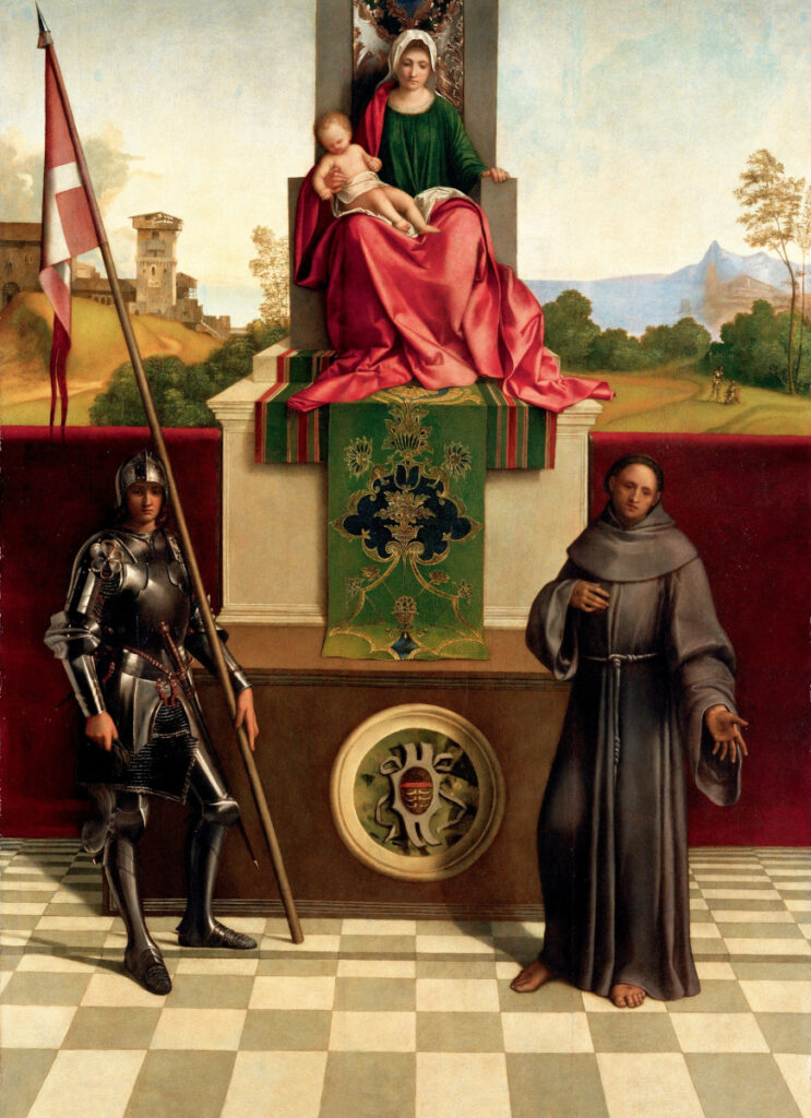
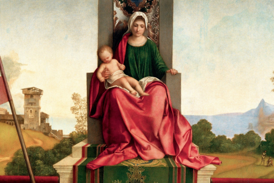
Costanzo Tuzio commissions the art piece for his private chapel, after the death of his son Matteo. On the foreground we recognise a triangular shape that connects the three main characters: the Virgin, Saint Nicasio, that holds the flag with the Cross of Malta, and Saint Francesco, that is addressing his glance outside of the painting, perhaps watching the viewer. The checkboard pattern floor highlights the linear perspective used to build the space in which the scene takes place. The vanishing point that you can find following the floor lines stands right behind the Virgin. Mary is sitting on a throne onto a coffin on which we can see the family crest. A red cloth divides the foreground from the background, in which on the left side of the Virgin we can see two soldiers who remind of young Matteo, dead in battle. On the right side we see some ruins that give a sense of human presence. Tonalism is used to define volumes, not only in the landscape, but also in the drapery and the modeling of the different characters. The use of light and shade – not using black, but different hues of the same colour – defines gesture and texture with an extraordinary elegance.
Federica Colle